CategoryAnimation

Animating Aubrey: How I Made Player Animations for Symbiote

So I recently made a game in 30 days for an indie game competition. Here’s the game page (with screenshots and download, etc): Symbiote

Today, I want to talk about the player animations in Symbiote. One of my main goals with the game was to have really solid and fluid animations for the player. I think that I’ve mostly succeeded.

This short video shows the gameplay in symbiote and the final look of the animations in-game.

The original plan was to use traditional hand-drawn animation. That approach, however, would have taken me the entire month just to do the animations– and maybe longer. So instead I went with modular animation or “puppet animation”. This technique is A LOT faster (I was able to get all the base animations done in a single day).

This is the sheet of pieces that I used for the player character:
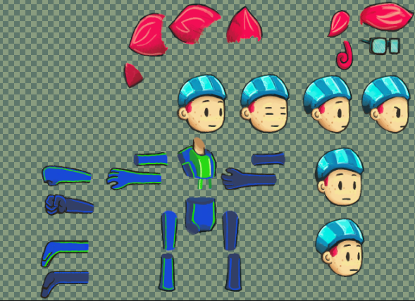
Sprite Pieces

Sprite Pieces

I used Spriter Pro to put the pieces together and create the base animations. This is what the base idle pose looks like when put together in Spriter, using the pieces from the above image:

Aubrey in Spriter Pro

Aubrey in Spriter Pro

Now, Spriter has a huge amount of really cool features: bones, kinetic animation, etc. I didn’t use them.

Coming from a background in traditional animation, I wanted total control over the pieces. Instead of using bones, I positioned each keyframe manually. Most of the time, Spriter’s tweening functions did a great job smoothing the animation between my hand-made keyframes. Occasionally I would tweak the in-betweens (particularly for the more complex animations, like the attacks).

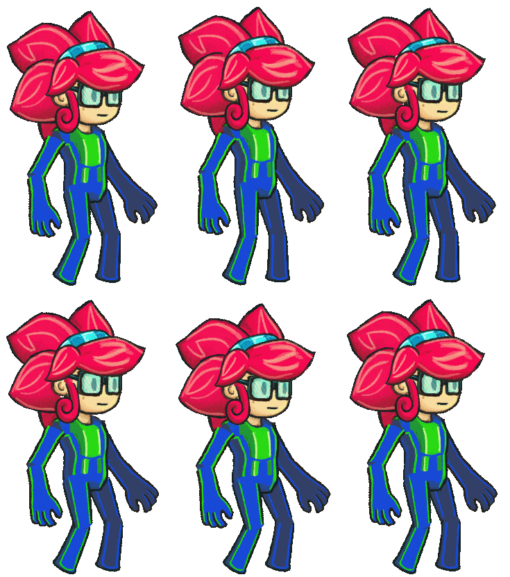
This is how the idle animation came out:

Idle Animation version 1

Idle Animation version 1

It looks really smooth, and I love the subtle squash-and-stretch effect (which I use often in my animation to give a stronger sense of weight). Of course, the problems with modular animation are evident: the joints connect awkwardly (and in the case of the shoulder, don’t connect at all).

There are some solutions for this that work within the modular animation approach: for example, drawing rounded shoulders or individual pieces for the joints themselves. These solutions would work for some types of animations, but I knew that I would need a huge variety of animations — and ones that made heavy use of squash-and-stretch techniques, and that would require me to create a lot of different versions of each body part: I felt that at that point, the time commitment wouldn’t be much different than animating in the old fashioned way.

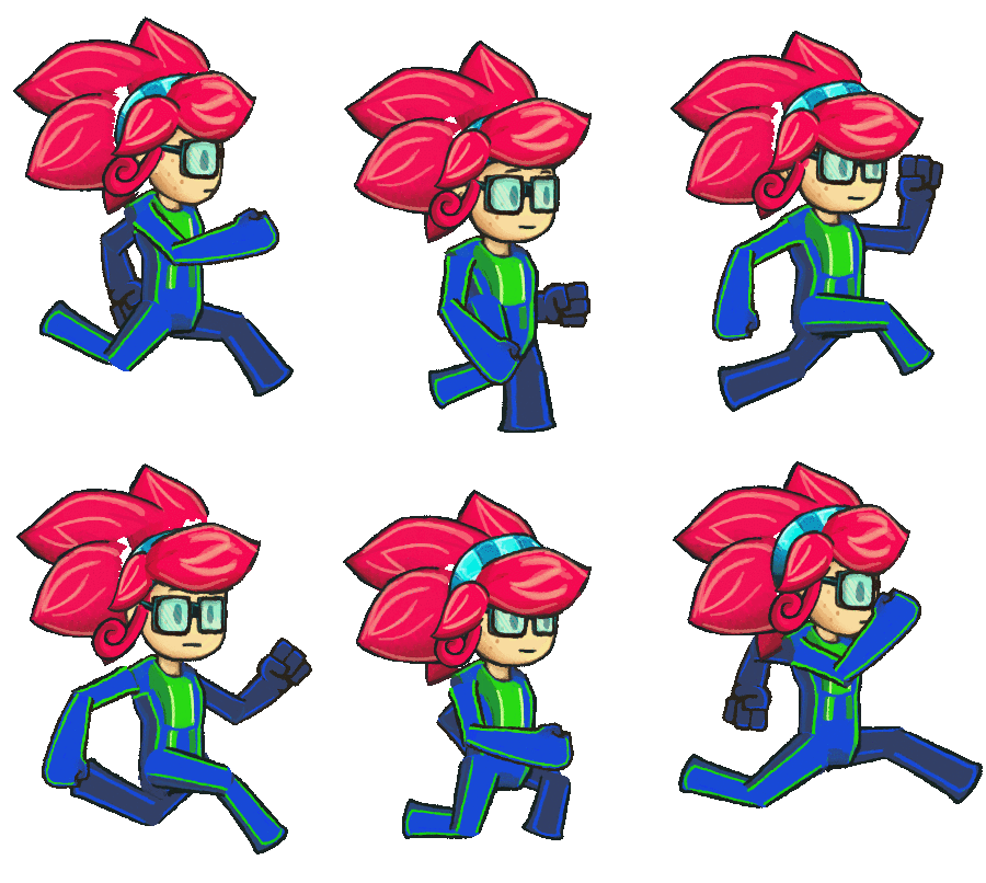
The running animation had similar problems:

Run Animation version 1

Run Animation version 1

Beautifully bouncy and full of character, but those joints look painful.

There were also other problems: notice the blank areas underneath the hair. I thought about changing the hair pieces themselves to have a red “base” which would serve as the back of the head, but that limited some of the ways I wanted the hair to move in other animations. Creating a simple red “back of head” layer could have worked, but at that point I knew that I planned to manually clean up the animation anyway.

I used these “puppet versions” of the animations for prototyping the game, and for the majority of the development process. They functioned just fine in-game.

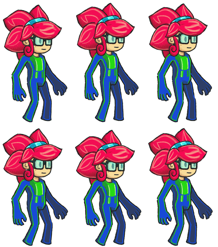
Towards the end of development, when all the programming was finished and the level designs were implemented, it was time to dive into polishing the graphics. So I took each frame of the player’s base puppet animations, popped them into photoshop, and went at them with my wacom pen:

Idle Animation version 2

Idle Animation version 2

You can see some jittery evidence where I manually edited the frames: the shoulders, elbows and knees were the areas of the biggest concern.

The jittery line on the hip betrays the haste with which I went through this process (there were a lot of frames, after all)– but the classic artist’s trick hides these problems: the original images are all HUGE and they downscale for the game itself. The images you see on this page are downscaled from the working size, and they’re still about twice as large as the in-game sprite.

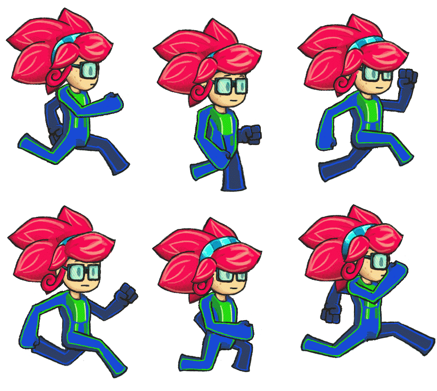
And the run animation:

Run Animation version 2

Run Animation version 2

Overall, I only spent two and a half of my development days on the hero’s animations. Half a day turning my concept art into useable sprite pieces, one day making all my base puppet animations in spriter, and one day fine-tuning each animation in photoshop.

With more time, I’d smooth the animations even further (for example, the way she turns her head in the run animation above seems kind of choppy compared to the rest of the animation)– but those details likely wouldn’t even be noticed in this project. Again, that magical downscaling trick hides any problems with the animations.

I’m really happy with the end result. The modular approach to animation saved me a HUGE amount of time, and going in to manually clean up the sprites ended up giving them that traditional-animation feel that I love so much. The blend of the techniques worked really well, and I think that I’ve succeeded when it comes to my goal of solid-yet-fluid animations for Symbiote‘s player character.

In future projects, when I’m not on such a strict deadline, I imagine that I can come up with some really cool stuff.

Thanks for reading. :)

Walk Cycles, Part 3

In my previous pixel tutorials, we explored the basic walk cycle. We looked at the differences between the 3-frame and 4-frame walk cycles, and finally completed a smooth 8-frame cycle for a front-facing sprite. The lift-plant-push motion of the legs, which we discussed at length, is the key motion for the walk animation. This is the guy we’ve been working with for the past couple of tutorials:

8 unique frames

Full 8-frame front walk cycle

Now it’s time to dive in to the side-view walk cycle. The first step is simple: we create the basic side-view of the main sprite. This is covered in a previous tutorial: The RPG Base’s Four Directions. I’ll often create a version without arms first, to show the character’s outfit. Remember that the animated walk will have arm movement, so it’s helpful to know what the side will look like behind the arms. From there, we can just put the arms on top of it.

idle_noarms

Side idle; no arms.

Next, it’s easy enough to make a version of the same sprite with the arms in their basic idle position:

idle_arms

Side idle; with arms.

Now we begin animating.

Blocking the Moving Parts

I’m going to use the armless version as the base. Since we want to avoid the hideous step-idle-step walk cycle (for reasons explained in part one of the walk cycle tutorial), I’m also going to delete the legs. We start with just the torso, and it’s used mainly for positioning.

The easiest way to begin an animation is to create the moving pieces as “blocks” of solid color. It will help you visualize the animation without the details getting in the way. Using a different solid for color each major piece will also help keep each moving piece separate, which will become incredibly useful when we have multiple limbs moving on their own.

Side walk, single leg blocked

Side walk, single leg blocked

I start out with four frames: the above image only uses the four main keyframes. I explained the motion of the cycle in-depth in the first two parts of the tutorial, so I won’t go over it again here.

Trainer Tips!

These might look pretty small in your browser. Please feel free to open these images in your image editor and zoom in. Take a look at the details. You’ll see plenty of sloppy pixels in the animations at first (don’t be afraid to be a little sloppy when laying down your forms in the early phases of the animation), but if you use a program like Photoshop or GraphicsGale, you’ll be able to open the animated .gifs and see how each frame transitions to the next.

Once your major keyframes are in place, add the other frames to smooth it out. When you add the other frames, you’ll probably need to reposition other elements of the sprite as well: notice the way the entire body moves up and down twice during this cycle. In the initial 4-keyframe animation above, the full-body movement was different.

8 frames, one leg blocked

8 frames, one leg blocked

Once we’re happy with the way that the full animation looks for the first leg, we add the second. I used the same method as above. First, I filled in the major keyframes. As a result, the back (pink) leg appeared to flash a little bit, because the full 8-frame animation was still intact. But from there, it wasn’t difficult to create the inbetweens and smooth out the entire animation.

8 frames, both legs

8 frames, both legs

Trainer Tips!

In this example, I finish the full 8-frame cycle of one leg before I created the other. You might approach it differently: it might be easier for you to create the 4 keyframes for both legs before expanding the animation to the full 8-frame cycle. Use whatever approach you feel most comfortable with. Your workflow is your own.

Here, you can see the 8 frames next to each other. Notice how each leg moves the same way, but with different timing. The pink leg and the blue leg follow the same lift-plant-push cycle, but when one leg is being lifted, the other is being planted.

All frames

All frames

We’re happy with the motion of the legs, so we can fill them in with details if we want. For the time being, I’m going to keep them like this, because I want to move on to animating the arms.

Arms

The motion of the arms in a walk cycle is much simpler than the motion of the legs. The legs have a more complex motion, because the legs are used to propel the body forward.

The arms, during a simple walk cycle, will simply swing back and forth. A simple pendulum motion is enough to begin thinking about the arms. The pendulum motion becomes slightly more complexs when you factor in elbows and the way that arms naturally bend when they swing. When the arm moves forward, the elbow has freedom to bend, but when the arm moves backward, elbows don’t bend that way, so the arm tends to be straighter (except during a run, when the runner will typically keep his elbows bent through the cycle).

In the sprite below, you’ll see that I have the full motion of the arms laid out. In most frames, the arms are represented by blocks of solid green. In two of the frames, the arms are the same ones that I’ve already made when I created the idle sprite. When I animate the arms on a walk cycle like this, I’ll begin by using the basic “straight” arms that we already made. I can copy them into the “passing” positions, when they hang straight down.

By copying these arms onto the right frames of the animation, it creates a solid base around which I can animate the pendulum motion.

With arms

With arms

You can only see the back arm in its extremes, it’s hidden behind the body during a lot of the animation, but when the front arm is at its furthest points, the back arms is the most visible. This is a great way to show the depth and three-dimensionality of the character in the animation.

Also, note that the arms move in reverse of the legs. When a leg moves backwards, the arm on the same side will swing forward. And vice versa. This is the body’s natural way of retaining balance while walking. If your legs and arms move in the same direction at the same time, it will look very unnatural.

Below, you can see the full 8 frames, and see how the arms move counter to the legs.

with arms, frames

with arms, frames

The next step is pretty straightforward. It’s also the most tedious and boring part of animation, in my opinion. Now that you’ve animated the limbs to your satisfaction, all you need to do is fill in those blocks of color with details and shading. Use your original idle sprite as a guide, and draw in the details of the arms, legs, hands and boots for each frame.

Now you should have a fully functional walk cycle. In the next part (and hopefully the last), we’ll finish up the walk cycle tutorial by polishing the animation with some additional small details.

Walk Cycles, Part 2

Whew. It’s been a while, but I’m here with the follow-up tutorial on Walk Cycles. Make sure to check out the previous tutorial on the subject before continuing.

In the previous tutorial, I went over what a walk cycle is. How they work, and how they are commonly implemented in video games. I discussed the pros and cons of walk cycles of various frames.

Today, we’re going to dive into the actual creation of such a walk cycle. We’ll begin with the front (south)-facing direction. Let’s start with a new sprite:

dude

This guy.

I intentionally made this guy asymmetrical. His arms are different. This will force us to pay attention to each frame and prevent us from simply copying and flipping the sprite. Continue reading

Walk Cycles, Part 1

It’s been a while since my last pixel art tutorial (over a year! sorry guys!), in which I introduced the basic ideas of animation. It’s time we dive into animation itself, and we’re going to start off by looking at one of the most important animations in game development: the walk cycle.

Dat walk.

We’re going to be looking at the side view walk cycle (the front and back cycles will be explore in the next tutorial). Why? Multiple reasons. For one—it’s the most complicated, from a pixel art perspective. It typically takes more time to create the side view walk than the front or back views (the front and back walk cycles are easier to “cheat”).

But there’s a reason: the side view walk cycle best shows the motion of the limbs. Continue reading

Basics of Animation

Animation is a huge topic, and I’m not going to pretend to cover everything. This tutorial is only going to cover a few of the most basic ideas that will be important going forward in pixel art—if you’re interested in animation (and even if you’re not), you should search around for more detailed articles (or books) about animation.

Watch any old school cartoon (Mickey MouseLooney Tunes) and you’ll see the following techniques used all over the place. Animating for pixel art is different from traditional animation because you won’t be animating entire scenes at a time—most of the time you’ll be working with individual sprites: characters and objects. But the useful tools and principles are the same.  The following techniques are used to give an object weight.

As weight guides motion, simulating weight is how good animation becomes believable. Continue reading