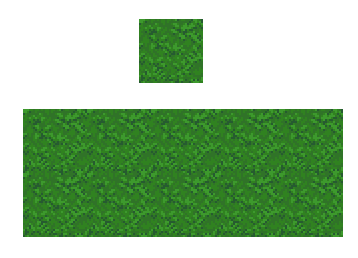
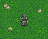
Before we dive into animating or clothing our RPG Base from the previous tutorial, we’re going to take a break and make something that people seem to have a tough time with—a grass tile.
I’m going to cover a very important topic in this section that will be important to know when going forward, so if you’re itchin’ to do more with your naked RPG sprite, bear with me. It’ll be worth it.
The focus of today’s article is going to be on tiling and pixel clusters.
What is a Cluster?
A pixel cluster is a group of pixels of a single color that work together to represent a shape or a plane. You’ve been using them all along, but now that we’re starting to dive into work that’s more focused on detail, it’s time to start paying special attention to them.
Do you remember this guy, from the section about contrast?
You can clearly see that he is made up not of individual pixels—but groups of pixels. The most immediate example is his hair: a single yellow cluster of pixels is enough to represent the shape. If a single pixel within that cluster is changed, the entire shape of the hair changes. All of the pixels within the cluster work together as a group. The difference between pixel art and traditional art is that a single pixel can drastically change an image—this is because of pixel clusters.
A good pixel cluster portrays a surface on your three-dimensional form—a plane. By placing clusters of different shapes and colors next to each other, you assemble your form by suggesting the relative positioning of the planes. Maximizing the relationships between pixels to create clusters (and the contrast between the clusters) is how you give your image depth.

Here’s a simple leaf segment—the idea is to show that the image is made of clusters. The first cluster is hardly recognizable as an object at all: it’s just a blob of green. But when we add a second cluster to it, depth is created—the eye recognizes the two clusters as separate planes that are connected. The difference in colors conveys light; and the light creates depth. In the third image, the leaf is still formed of two main clusters, but additional buffer colors are added to ease the transition.
With our understanding of pixel clusters, we can dive into making use of clusters to build our grass tile.
Author’s note: This section about clusters might fit better in the tutorial on Form and Light. Remind me to consider shuffling things around when the full series is finished.
Creating the Grass Tile
This example is for an RPG perspective, but the same ideas can be applied easily enough to a side-view perspective—in fact a grass tile for a platformer would be easier because it only needs to tile horizontally rather than on all four sides. The ideas will be the same.
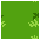
I start with a blank square—in this case our tile is going to be 32 pixels by 32 pixels (32×32) and fill it with a single base shade of green.
In classic SNES games, tiles were 16×16, and that isn’t a bad starting point. I use 32×32 because that’s the size of the tiles that RPG Maker VX Ace uses. The size of your tiles will vary depending on the engine you are using for your game (or if you are coding it yourself). A lot of modern games don’t require specific tile sizes at all, and you have a lot of freedom with making objects and tiles at whatever dimensions you want.
On top of the base green I’ll create some really basic clusters to look like little clumps of grass. I usually start with the edges first. Why? To make tiling a lot easier. Tiling (as a verb) is an important (and tedious) part of making tiles for game graphics. It’s vital that your graphic can loop with itself. Since this is a grass tile for an RPG, we want it to loop both horizontally and vertically: it should be able to repeat seamlessly.
There are lots of ways to make sure that your tile tiles well—I’ve seen tutorials that teach you how to cut up and rearrange your tile so that all the sides line up perfectly, and that method is just fine. Personally I think that it’s a bunch of extra work. The easiest (and most efficient) way for me is to draw around the edges first. For example, if I draw half of a grass cluster, I’ll just draw the other half on the other side of the tile.
Take a look:
Make sure that your clusters line up nicely: remember that something that goes off the edge on one side will loop around to the other side, and something that goes off the top will loop around to the bottom.
And then I’ll add a couple more. I used a different color here to make it easier for me to visualize how the clusters will connect.
If you’re not used to visualizing the loop in your head, remember that you can always copy and paste your tile to see how it looks when repeated.
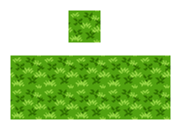
After I have some satisfying edge clusters, it’s easy to fill up the middle. Here’s what the tile looks like after I lay down the basic clusters to begin with:
It tiles nicely—it’s hard to tell where each tile begins and ends. There is some repetition, but at this stage that isn’t too big of a deal as long as you don’t have any glaring lines.
Since we’ve established that it tiles okay, we’ can eliminate the different colors for the clumps. Go ahead and start with some basic shading—remember to keep in mind light and form.
It’s starting to shape up: each clump of grass has depth to it. If you see any serious problems with the tiling, now is the time to fix it. It should look like grass at this point; you know what your grass tile will look like when it’s finished. At this point, the hard part is over. What comes next is just more shading and polish.
You might have noticed that the colors are changing as the tile progresses. As I work with colors, I will continually modify the palette to suit my needs—and you shouldn’t be afraid to do the same thing. Don’t feel constrained to the color palette that you’ve created for yourself. Most pixel art programs will allow you to easily change your colors in a clean way that will update the entire document.
Also, I usually use a separate palette for the background tiles with less contrast than the palette I use for the characters. A lot of the major base colors will be shared between the two palettes, but it’s important that the characters and objects pop out from the backgrounds. When you’re creating art for a game, readability is always the most important priority.
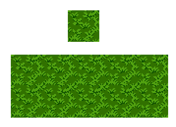
Take each clump of grass individually and shade them to give them depth—remember your light source and think about form. Don’t worry about creating individual blades of grass: that will create a noisy effect that will only distract the player. You want to suggest the larger form. Emphasize the bunches:
It’s looking pretty solid—definitely a grass tile. The only thing left to do is fill in those ugly gaps between our little clumps. It’s pretty easy, really: you only need to use one color and create some clusters to suggest more leafy blades between the large ones. It creates a texture that gives some more depth and breaks up the monotony of the “valleys”.
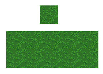
The effect softens the entire tile and helps blend the grass nicely. Note how smooth the entire tile seems now—the hardness of the initial stages is gone, but there’s just enough contrast that the grass texture is immediately readable. It’s important that the final colors of your grass tile are soft enough so that they do not distract the eyes from the character or object sprites. For all the work that we put into the grass tile, we don’t want the player to notice it. If we do our job right, the player will “feel” the grass without having to look at it.
And when we’re happy with those final softening touches, we can call it finished.
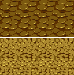
Hopefully you are comfortable making a grass tile—I’d love to see what you have so far; leave a comment or hit me up on twitter. Don’t be afraid to experiment! Now that you can make a grass tile, try your hand at other textures too. The process is the same, even if the shapes will be different:
Next time we can get back to our sprite. :-)


