CategoryBlog

Free Platform Game Graphics

I made these graphics some time ago for a platform prototype. I’m releasing them today because I figure that some people out there might have a use for them. These aren’t for making a full game with. They’re some animated sprites and tiles for use in creating platformers, useful for prototype development. Developers might find some use for them as placeholders when creating platform engines and whatnot. Enjoy.

Platformer sprite

Platformer sprite

Download

Here are the individual files that you’ll find in the zip file. This way you can download individual graphics or just look at them.

Player Sprite

Enemy

Tiles

Objects

Enjoy.  There’s not enough here for a full game, but maybe you’ll find them useful.

I ask that you don’t sell anything with these in the final product (or at least contact me first). I’m releasing them primarily for use as functional animated placeholders. If you want to make a free game with them, though, that’s fine. Just tell me about it so I can check it out.

Happy New Year 2015

WOAH THE WEBSITE LOOKS DIFFERENT (again)

Yup. With the new year comes a new visual direction for the site., and (hopefully) this one will last for a while. This change has been in the works for some time now. I’m going to take some time to talk about the major changes here.

Content First

First and foremost, the redesign for the main page puts an emphasis on the amount of content that fbb has to offer.

I’ve said time and time again that the focus of this site is on high-quality articles and tutorials, and the design is meant to emphasize that. The bulk of the content on this site is NOT intended to be consumed like typical blog content: pixel art tutorials or articles about game design will always be relevent, not blog posts that should be cycled through and ignored after they’ve had their time at the top of the front page. In theory, the new design for the main page should help users discover the vast amount of topics that I have to offer. This website showcases a LOT of articles and tutorials that I’ve written over the years, and I think that the new look of the front page helps users unserstand that.

I’ve also removed the forums (not that anybody used them, haha) and other things (nobody ever submitted any content, so the “submit content” page is gone. It still exists if you know the URL, though ;) ). Fbb is never going to be some sort of place for social gathering, and the new design puts the focus on what the site IS: my collection of quality articles and tutorials for game designers and game artists.

In a way, the redesign is focused on making the site both more AND less self-focused. I hope that makes sense. :P

Blog Section

As a counterpoint to the above, the blog section of the site now has more prominence. In the past, I’d primarily used this category to provide short updates on the state of the website, but those posts were hidden in the sidebar and often ignored.

One thing that a blog section offers is the opportunity for posts that aren’t as deeply thought-out as the full articles. I often have thoughts and ideas on subjects (game design, art, and plenty of other topics), that I think that fbb’s audience will find interesting. But most of the time, these thoughts aren’t worth a full article. An example of this is the more recent blog post On Hearthstone’s UI. The post shares some thoughts and insights that I came to while playing Hearthstone. Not worthy of a full article (at least not yet), but worth sharing. I plan to make use of the blog section for more posts like this in the future.

And because the blog section naturally has a more personal nature, I can also use it to share pieces of things that I’m working on, like the recent post that showcases the map that I created for the City of Prosper.

In theory, this means that the site should begin to have more frequent, smaller updates in the blog section. It should help provide a balance to the article content, which admittedly takes a LOT more time to create.

State of the Podcast

You’ll see that the podcast section on the front page has moved to a small section underneath the other content. :(

We’re TECHNICALLY between “seasons”. As I’ve said a bunch of times to people who have asked, it’s been very difficult for us to set up a regular recording time, now that our hosts have new jobs and schedules and whatnot. I very much want to continue with the podcasts, but it will probably be some time before we can commit to a regular schedule again. For this reason, I’m calling this extended break a hiatus between seasons. When we’re able to produce regular podcast episodes again, I’ll announce the second season and move the content to a more prominent section of the main page.

Other

Of course, as with any major redesign, there might be some little errors. If you find any broken links or strange visual glitches, PLEASE LET ME KNOW. Over the next few weeks, I plan to take the time to look at and clean up some pages or older articles. If you spot anything that seems broken, bring it to my attention. The quicker that I can fix this stuff, the quicker I can get back to creating new content.

Thanks all. I hope you enjoy the new layout, and I hope it makes it easier for you (and for new users) to find the content that fbb provides.

Let’s have a strong 2015

Worldbuilding: City of Prosper

Hey guys. Here’s something that I’ve been working on for the past couple of weeks. It’s mostly for my own reference, but you might get some enjoyment out of it.

It’s some worldbuilding stuff, and it goes pretty deep into looking at a single city, with a detailed map of the city’s streets and buildings. There’s also information on the government and culture and stuff.

I made a page for it, since it’s pretty long. Check it out here: City of Prosper

Old School Modern 2 Freebies

Yo. Sweet news! My second official RPG Maker DLC graphics pack has been released.

The first pack that I made was called Old School Modern, and you can check it out here.

The new pack is an expansion on the first one, and it mostly includes a shitload of new characters, as well as battlers for nearly all of them. You can find it here.

But i’ve also got free shit for you guys! It’s all in the style of these packs, so enjoy some compatible extras.

First off I have these two windowskins for use in RMVXACE. I think that they might have been added into the packs above, but I made them to be freebies, since they’re versatile enough to be used in any “retro” double-pixel style. Of course, they use the same color palette as the OSM graphics so they’ll look nice if you’re using the packs.

You can download these images by right-clicking on them and saving them.

Window2

Window

Those windowskins, and other free interface elements, can also be found on the OSM 2 store page. Check out the bonus link on that pace.

But wait! There’s more.

I’ve also gone ahead and created a couple of unique characters as exclusive freebies for finalbossblues.com. Let’s reward you guys for keeping up with the site.

These are the two characters that I’ve made for you guys. They also come with extra poses: nodding, headshaking, laughing, and down.

osm_heroes

Click the image to download the full-size version.

And finally, here are the battlers for these two characters. These battlers match the style of the battlers in the OSM2 pack.

osm_girl osm_boy

I hope you guys enjoy the graphics packs, and these free extras. Happy game making. :D

On Hearthstone’s UI

Just some of the things I have been thinking about and/or working on lately.

Hearthstone UI

So I play quite a lot of Hearthstone these days, and I love this game.

I come from a long background of playing Magic: The Gathering, playing the card game casually ever since I was in elementary school. I love the game of Magic—my left shoulder is actually tattooed with the five mana symbols from the game—and have written about it in a number of my articles on game design.

I’ve played Magic Online on and off with some regularity for the past five or six years. But over the past couple of months, I’ve logged into MTGO only twice, and only played one draft each time before getting annoyed/bored, closing the client, and picking up a few games of Hearthstone.

Why? If it was just about the game themselves—building decks and playing with cards—Magic is a stronger game. More depth, more complex decisions, larger cardpool, twenty years of history… But that only matters when I’m playing with the physical cards in my hand. Playing online, Magic almost feels like a chore.

Two reasons why. One: Magic wasn’t originally designed to be played online—it doesn’t translate well, making for an experience that often seems roundabout and unintuitive. Two: the Magic Online client sucks ass.

Hearthstone, on the other hand, was designed to be played online, and the gameplay is built beautifully into the client itself. The interface is just as much a part of Hearthstone as the cards themselves, and it looks, sounds and feels absolutely wonderful.

yeah thats me kickin ass

Yeah, that’s me crushing a zoo player. Felt good.

This screenshot doesn’t even do it justice. The biggest success of Hearthstone’s interface is how it feels SOLID and REAL. It’s in the animations and the sound effects. In this screenshot, you can see that the Warlock has just used his hero power—the little graphic for the Life Tap is flipping above the game board. Seriously, if you haven’t played the game check it out. And if you don’t have an interest in playing the game, look at a stream on Twitch or something (find a stream that doesn’t mute the in-game sounds), long enough to see how SOLID the interface feels.

Each card feels like a physical object—and so does every menu element. Each card has its own sound effect and voice clips, and they move around the board with real weight—casting shadows when they leap up to attack—large minions slam into the game board with impact that puts cracks in the dirt. It looks, sounds, and feels amazing.

It’s because of this SOLIDITY of the interface that the game is so enjoyable. There was a time when the generally accepted school of thought was that interfaces should be invisible—Hearthstone makes me question that. A solid interface can be as tangible as any other element of the game—and can ground the game even more as something that feels physical, like you can touch it.

Certainly tablets and other touchscreen devices have contributed to this. It’s interesting to think about the evolution of game and app UI, and imo Hearthstone is a very strong example of a modern UI that really goes overboard—in a good way—when it comes to making the game feel like it has real weight. And it makes the game even more fun.

Old School Modern Graphics Pack

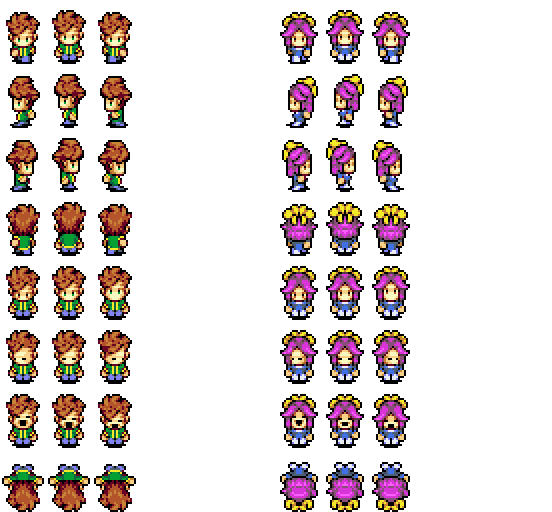
In other news, I’ve been working on the expansion to my RPG Maker graphics pack (currently available on steam). The expansion pack is going to be focused primarily on battlers, something that wasn’t included in the first pack—I have a shitload of new character sprites, humans and monsters, and nearly all of them will have a matching battler.

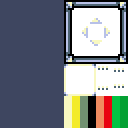
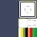
But there will be some tiles, too. Here’s a preview of what I’ve been working on.

osm map tiles

Preview of the overworld tileset.

Yup, the new set will have some sweet modern overworld tiles. This is a mockup map that I threw together to show some of them off.

I also have some secret plans for the future, but might be a while before I have time to implement them. ;)

Forum Online! Whaaaat?

Update: Nope.

Forums seem a bit outdated these days when everything is so connected. Leave comments on the page or we can chat on twitter or facebook or whatever.

——–

I’m trying a beta launch of a forum for this site.

Whaaat? Forums? Why?

We’ve been publishing high-quality content on this site for a while now. It comes with the territory that a lot of people ask me for advice on their pixel art and their game projects. Email isn’t the most efficient, especially since a lot of my advice is general and would be useful for a lot of people. It seems like a simple forum would be the perfect way to create a space for opening up that kind of discussion.

I also find that giving feedback is one of the best ways to improve your own skills. To critically analyze somebody else’s work is a fantastic way of getting better at the craft. This board isn’t just space for “hey despain what do you think of this thing that I made?” (although that’s fine, I guess)—but a place for people to share and critique each other’s work. This provides a place to do just that.

Check it out.