


I recently played Skyborn. It’s one of the more attractive commercial RPG Maker games out there, and there’s been a lot of talk about it, mostly good. You can find it on Steam.
Still, I wasn’t expecting much from Skyborn. I’m pretty critical of RPG Maker games, and despite the impressive steampunk aesthetic, I wasn’t sure whether the game itself would impress me.
It did and it didn’t. I played it all the way through, which is saying something. But for the most part, it left me thinking “eh, this was okay I guess.” Is it worth the price? You be the judge of that. Beyond these initial thoughts, this is not a review—my goal is to look at some of the design choices made in Skyborn and what we might learn from them when creating our own RPGs.
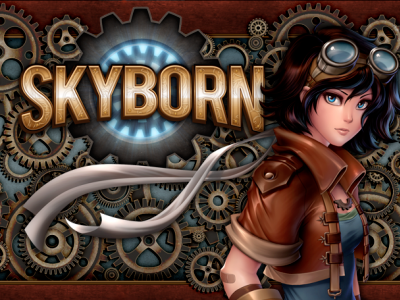
Skyborn
Some of these choices are excellent, and contributed tremendously to my desire to complete the game. Others… not so much. The game provides a lot to discuss and think about.
Skyborn appears to be the most polished commercial RPG Maker title currently out there. And while it is a good example of a solid RPG Maker game, it’s far from being great.
The Good
Skyborn provides some clever innovations when it comes to the battle system. While it’s a traditional RPG Maker system for the most part, a couple of features add to its depth without feeling like they get in the way or add too much complexity. As a result, the combat succeeds in being heavily based around strategy.
The first of these is the unique “threat” system. The character with the highest threat level will be targeted by enemies, and threat builds when characters do damage. And the best thing about the threat system—Skyborn really maximized it. Some skills would add additional threat. Equipment would also affect how much threat a character would start with. One character learns a move that allows her to “blame” another character for the attack—increasing someone else’s threat level. The threat system itself introduced a lot of unique design space, and Skyborn did a wonderful job finding interesting ways to make the most of the mechanic.
The battle system also promotes strategy because of imbalanced hero characters. Imbalanced in a good way. Each character has a specific battle role, and they’re balanced to reinforce that role. For example, the healer character does a ridiculously low amount of damage from his regular attack commands, encouraging the player to use his magic instead. His low damage is offset, however, by the massive amounts of damage that Claret is able to deal with her dual pistols. Each of the playable characters is balanced in this way, with their own shortcomings and strengths.
The result is interesting. While the characters seem unbalanced when put up next to each other (Claret seems a million times more useful than Corwin or Chaska because of her damage output), the entire party becomes well balanced together. It’s clever design that encourages strategic thinking in the battles, and even reinforces the player’s emotional ties to each character.
Possibly my favorite feature is the “retry” feature. It’s nothing fancy, but it goes a long way towards avoiding frustration. When your party dies in battle, you have the option to retry from the beginning of that battle (or you could return to your last save, if you need to do some more grinding or something). It’s clean, simple and makes the player feel so much better about the game in general. If it weren’t for this feature, it’s likely that I would never have finished the game.
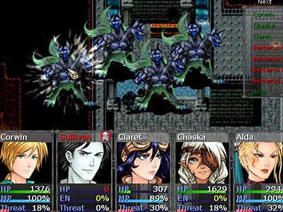
Skyborn’s battle system.
Moving away from the battle system, Skyborn does a good job with some of its other features. It includes an augmenting system which allows the player to upgrade weapons and armor, often increasing their stats, but sometimes giving them additional bonuses as well. The augments were simple and straightforward to use, which was a huge plus. I’ve seen systems like this in the past, and they were poorly implemented, but Skyborn‘s augments are (for the most part) easy to use and understand, so it felt good to customize my equipment.
The same can’t be said about the crafting system. More on that one later.
Storywise, nothing stands out as particularly incredible. There are some cool ideas here, but few are really expanded on in any meaningful way. For the most part, it’s a typical “rebellion against the opressive overlord class” story. The one aspect that is notable, however, is that the primary characters stand out with their own personalities. Again, none of them are genre-defyingly original or anything, but they’re strongly written in the sense that they stand out from each other. A line of dialogue from Corwin will sound like something he would say, and a line from Sullivan would be his own. The characterization of the main cast was done well, though it was disappointing that the story didn’t leave much time for character development beyond their primary arcs. They did have those primary arcs though, so I’ll give them that.
The Bad
We’ll get the smaller annoyances out of the way before I dive into Skyborn‘s biggest problem.
For starters, the game uses an unfortunate amount of RTP (the default materials that come with RPG Maker). In lots of peoples’ games, this isn’t a big deal. But Skyborn is a major commercial game that is featured on Steam. And it’s more than just tiles. Any RPG Maker user (and plenty of other people, if they’ve played these kinds of games before) will recognize the stock battle animations, sound effects, icons, monsters, etc. The heavy reliance on RTP is disappointing in a game like this—it screams “RPG Maker!” and makes it that much more difficult for the game to have an identity of its own. While the game had a decent emoung of original assets, it’s no more than I’d expect from any quality RPG Maker game. Custom portraits, charactersets, and a few tiles here and there is not enough to make the game stand out. That’s the minimum of what I’d expect in a commercial game. All of the promotional images for the game focus on the original assets (which is the right move, of course), but when you get into the game, you find yourself bombarded by the RTP.
The problem is amplified by some seriously awkward usage of those tiles. Nearly every map has this awkward perspective that uses single-tile-width bridges floating in front of backdrops. The backdrops tend to have art that’s a different perspective than the rest of the tiles, leaving me wondering what the world was supposed to be. The overuse of bridges, a large amount of one-tile-wide corridors and paths, and the tendency to cram as many object tiles as possible into each area lead to every map feeling cramped, cluttered, and inconsistent.
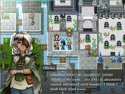
Sometimes the maps just have too much stuff.
While I liked the battle system for the most part, it had two major problems. The first one is simple: the interface was awkward. I enjoyed that the turn order was displayed on the screen (even though sometimes it appeared inconsistent and illogical), but the problem is that it was simply ugly. The color choices weren’t optimal, making the names sometimes difficult to make out (as shown in the screenshot above). Almost worse, often the names would be awkwardly crushed; letters squeezed together in order to force the names to fit the space. This same issue appeared in other menus as well, and often enough to where it shouldn’t be overlooked. While this is a small nitpick, it’s often these kinds of small oversights that prevent a game from feeling truly complete.
The other major problem with the game’s battle system is that there is a tremendous amount of confusion when it comes to status effects and character stats. Maybe the blame shouldn’t be placed on the battle system itself, but other areas: neither the stat values nor the status effects are ever really explained. The “speed” stat, for example, works different in this game than in other games. I spent a good portion of the game wondering what my speed buffs did, after I figured out that they didn’t really affect the turn order. Only after digging around in the game’s forums on Steam did I discover that it had to do with evasion or something, and didn’t affect the turn order. When a game uses traditional RPG stats in different ways than they are commonly used (and even not—explaining what the stats mean is something that should be included in every RPG, though optional), it should be explained up front. Likewise, most status effects don’t have any explanation of what they do, leaving the player to figure it out only after they have been inflicted upon his characters.
The biggest problem with Skyborn was that it was simply small. I don’t necessarily mean short (though it was short), but small in a variety of ways. While games can be excellent with a small scope, Skyborn feels like it often thinks that it is much larger than it really is. Or perhaps it was planned to be much larger, but then elements of the game were never scaled back to appropriately reflect the size of the final product.
Here’s the most glaring example: early in the game, I was told that NPCs with an exclamation mark over their head would give me a sidequest. Cool—pretty standard. I was keeping an eye out for them. But in the entire game, there’s only ONE of these such quest-giving NPCs. Only one. Why implement such a system when it’s only used by a single character who gives a single side quest?
The entire game centers around one central multi-tiered city. I’ve got no problem with that—I generally find that hub cities ofter more for a game than the approach that leaves a game with a hundred useless villages sprawled throughout a massive empty world map. But the city itself wasn’t very interesting. There were no cool secrets, and very few extra things to do. There’s a standard battle arena—but it isn’t particularly interesting (it doesn’t even have any fun aesthetic fanfare—you speak to the dude in front of the doors and you’re instantly in a battle without even stepping into an arena).
The world itself seemed small in the sense that the layout made very little sense. The game actually includes more dungeons than it seems like it does, because they’re often connected back-to-back, blurring the distinction between areas. This isn’t a bad thing in and of itself, but it lends to the overall feeling that the game world was tiny. A volcano, mine, treetop village, desert, and forested ruin island are all within the immediate vicinity of the central city, and often with no transition from the city to those areas. On top of that, none of these areas offered much in terms of exploration: they’re simply mazes with monsters in them.
The dungeons were unimpressive. None of the dungeons really included any puzzles, other than occasional switch-flipping in order to unlock passages. I get the idea—this game is combat focused and not puzzle focused—but none of the dungeons were mechanically separated from each other. None of them had any real identity other than their visual aesthetics. They all even had the same core style of layout—mazes with lots of awkard little bridges and the occasional switch to create a bridge. Take away the differences in the graphics, and all of the dungeon areas are the same.
Skyborn might be the best commercial RPG Maker out there right now, but it’s still not the kind of showing that impresses. Simply put, Skyborn lacks three major things: originality, depth and polish.
Now don’t misunderstand—I spend more time looking at the bad elements because there’s a lot to learn from here. Still, the game is solid and worth playing. I wouldn’t have been able to finish it if I didn’t think so. If you plan to release an RPG Maker game to sell for a profit, I’d suggest that you check out Skyborn and see what it offers. It sets the standard for you to beat.
Other Notes
- I played on hard mode until one particular boss, which would immediately cast an all-fire spell that killed half my team before I could act. Then I switched to normal and he was ridiculously easy. Played on normal mode from there on—at that point I felt that I just wanted to get on with the game.
- There’s an extended playable flashback sequence. I hate playing flashback dungeons, not just because they feel like filler. The story of that section was worthwhile and added to the development of the characters and the world—but the forced dungeon was just that: forced. It didn’t add to the progression of my characters at all, and the game would have benefitted from another real dungeon instead of this area. It also doesn’t change the inventory, leaving me hesitant to “waste” the items that I’d been collecting throughout the game (ignoring the fact that it doesn’t make any sense for these items to be present in the flashback anyway…). Luckily, my inventory was restored after the segment, but if I had known that ahead of time things would have been a lot easier.
- Multiple exclamation points/question marks, overuse of ellipsis, sentences in caps, etc, don’t have a place in serious writing (serious in the sense of professional, not in tone). Skyborn used all of those things, and each time it looked amateurish and took me out of the experience.
- The game includes a crafting system, which I didn’t touch on much. Its interface is done entirely through regular text box choices, making it awkward, and the gear that I acquired through it was all subpar and significantly worse than items that I’d bought in the store. Thankfully, it’s entirely optional and you can sell off your crafting materials instead of using the system. It’s a neat addition to include, though, since it’s an extra feature—I just wish it was clearer to use and had more significant rewards.