The newest RPG Maker program, RPG Maker MV, was recently released.
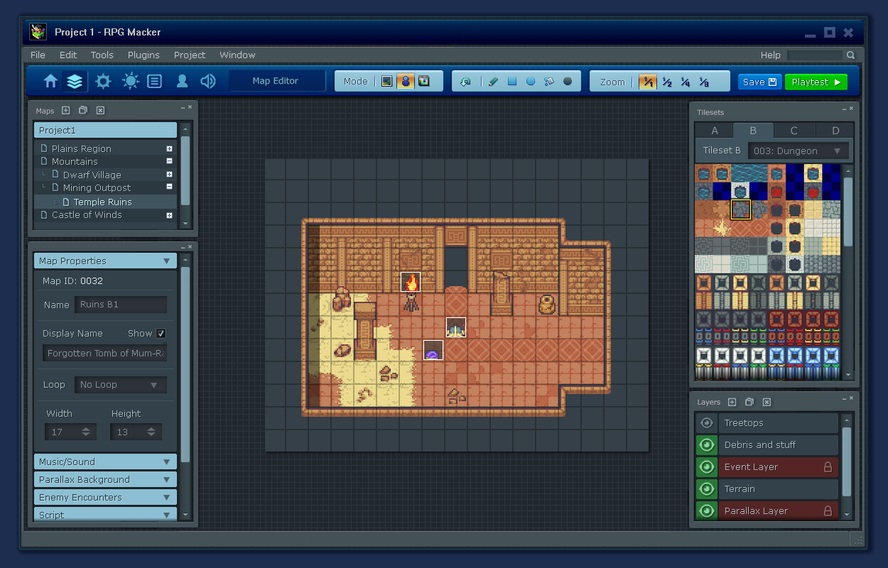
I don’t like RMMV’s UI– it feels awkward and outdated, especially when compared to other modern software like Photoshop, Game Maker Studio, etc. I also feel like RMMV really missed the opportunity for lots of improvements to the program; things that seem like no-brainers. So I thought that I could do better.
So here’s my vision of a more modern, improved RPGMaker UI (click for more):
More images and details here. It has a few huge images, as well as my notes, so it gets its own page.
What do you think?


