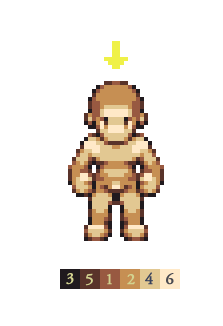
In the previous section, I spent a lot of time going over the importance of form and light sources. I tried to convey the importance of creating forms from shining light onto silhouettes—an approach to spriting that emphasizes depth in three-dimensional space. Today, we’re going to make use of that technique and create a sprite base.
Because most people reading this are probably developing an RPG, this sprite is going to be made for a game with that kind of traditional top-down perspective (though not quite top-down exactly—flawless perspective can be sacrificed in exchange for heightened readability, as long as the proper perspective is correctly suggested). If you want to make a sprite for a different kind of game—like a platformer for example, you could use the same technique but from a straighter perspective or maybe with a different light angle.
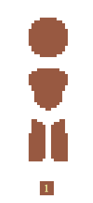
Starting is easy: I always start by suggesting forms with silhouettes.
In this example, we’re keeping the elements of the sprite separated. In practice I don’t usually do this, but in my mind’s eye the process is there. When you’re first starting out, it might be easier to visualize your forms by splicing them like this, and then bringing them together after you’ve begun to give them some three-dimensionality. Otherwise it might be difficult to mentally keep your pieces separate when they’re meshed together into a silhouette blob.
Where are his arms? Personally, I add the arms after I’m happy with the torso and legs—it helps me create better-looking proportions. There’s no reason you can’t be working on the arms at this step, though—just paint the cylindrical forms like you would with the legs.
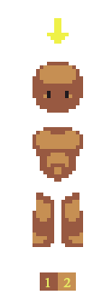
The sprite begins to look like a person in the next step when we apply some lighting.
A second color joins the first, but it isn’t particularly detailed. It does succeed in giving some depth to the image—the head looks like a head and the torso looks like a torso. The legs aren’t quite perfect, but it’s clear that they have a segmented cylindrical form. Now that it’s starting to flesh out a bit, we can safely pull the pieces together for the next step.
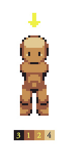
Now it’s beginning to look like a real sprite.
Another color is added: number 3 is our darkest shade and while it will function as our outline color, we’re using it now to further emphasize the darkest shadows and curves. Don’t go overboard with it—think about your light source.
A fourth color is added too, but I haven’t applied it to the body yet—I’ve only used it here to give the head some more definition.
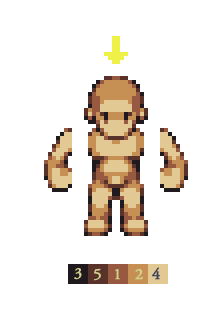
At this point we’re satisfied with the basic forms and the initial construction. With the next step, our goal is to refine, and it brings the sprite to a much more human, nearly complete, level:
Not only have we finally created the arms, but we begin stretching our colors to refine the sprite and start filling in some important details. Color 4 spreads out across the body, becoming a useful highlight, which allows for 1 and 2 (the original colors that we started with) to become useful as our primary midtones. At the same time, the addition of color 5—a buffer between colors 3 and 1—becomes important for shadows, which further emphasize form by expanding on the depth of the sprite. With these additional colors, we refine the cylindrical forms of the torso and the limbs. We’ve also given more definition to the head—including ears, which make it look more human and help create personality.
You’ll notice that the highlight on the top of his head has changed—why? It’s a hairline now. You don’t have to take this approach if you don’t like it; you might find it more helpful to keep to a pure-skin base and make the top of the head brighter from the direct spotlight. I find it useful to create a hairline like this because most of the completed sprites will end up having hair, after all. But it’s a personal preference. Do whatever you feel comfortable with.
Our sprite is shaping up nicely and looks nearly complete. All it takes is some more refining:
The final color is added: color 6 isn’t used very much, but it provides some highlights that make for a finishing touch. The head’s form is further refined with the use of the new highlight color, and now that the arms are attached the hands and shoulders are given proper definition.
This particular sprite has an even width—the horizontal width of the sprite uses an even number of pixels. In other words, it doesn’t have a single line of pixels that go down the middle—it’s missing a distinct line of symmetry. It might be easier for you to create a sprite with an odd number of pixels. Having a single line that goes down the center of your sprite will generally make things much easier, especially when it comes time to start putting clothes on him. Again, do whatever you think is right for you.
The sprite base is more or less complete at this point. You can keep plugging away at it until you’re satisfied, but be careful: it’s entirely possible to obsess over details for hours. As I look at it now, I can see little things here and there that can still be fixed, and I might go back to make little changes. But realistically, I’m okay with calling it finished.
There are two important things left to do with it: animate him, and start making some characters (with clothes!) based on him. We’ll save those for another time.
Good luck, and let me see what you’ve come up with. Leave a comment or shoot me an email.


