I spend a lot of time on a number of RPG Maker forums and a lot of that time is spent giving people feedback on their sprites. The most common criticism of mine has become something of a catchphrase and could even be thought of as a thesis to this entire tutorial series: your colors need more contrast. Color choice makes or breaks a sprite.
Colors—and the contrast between them—are the basis of every sprite. That’s exactly what pixels are: little blocks of color. Spriting isn’t like sketching or coloring in the lines; it’s about putting colors in the right places to create the illusion of form. I’ve seen a lot of tutorials that talk at length about lines and technique and shading and blah blah blah but pay very little attention to the absolute most important part of pixel art: color, and everything that comes with it.
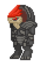
Take a look at this sprite—it was posted in a critique thread on HBGames.org by a member named Norton.

Structurally, it’s not bad at all. It’s based on a character from Mass Effect and that’s immediately obvious—and I’ve never even played the game, so job well done there. On the other hand, the colors are very flat because they lack significant contrast.
(Update: I have now played the Mass Effect games, and I love them.)
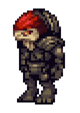
This is what I did with it—I changed very little of the sprite itself, but the updated colors make a huge difference. It pops—it looks like it has real depth to it. It’s the colors that bring a sprite to life.
Color Words Worth Knowing
While there are more than enough resources online that go over the following terms and concepts, I might as well write up my own. Note that most of the time these words really don’t factor into pixel art—or rather; they do, but knowing the exact terminology isn’t really necessary. The biggest one to think about when it comes to spriting is contrast, and I’m going to be devoting a whole section to that soon enough. But it’s still useful to have an understanding of these basic color concepts.
Color
The word “color” is really vague. When light is reflected off of any surface, your eyes recognize the color. From an early age, we learn that “red”, “blue”, and “yellow” are colors. Today, lots of people think of colors as “#FF0033”, “#003399”, or “#FFFF00”. But simply put, a “color” is a chunk of visual information that encompasses all of the following definitions.
Hue
When little kids are taught their colors, they’re really being taught hues. Hues are easy: red, blue, green, etc. A color’s name is generally referring to its hue. It’s possible to think about hues as categories of colors. Take a look:
This line of colors all share the same hue: green.
These colors, on the other hand, provide a range of different hues.
Brightness/Luminosity/Value
On a technical level, these terms have slightly different meanings (so slight that it’s not really worth caring about; it has do with the mathematics of making colors, but on a practical level they have the same function). The brightness of a color is just that: whether it’s bright or dark. A color’s proximity to either white or black determines its brightness.
Pretty much explains itself, right?
Saturation
A color’s saturation is very similar to its brightness, but instead of light versus dark, saturation is strong versus weak. A color with high saturation will really pop, while a color with low saturation will seem faded. For example, a highly-saturated blue will shout “I’m blue!” but the same blue with a low saturation would mope “I’m feeling a bit blue today”.
These three blues have the same hue and brightness, but drastically different levels of saturation. The left-most color is so desaturated that it’s almost gray.
A lot of people go overboard when it comes to saturation—in either direction. While a desaturated sepia-style color scheme can be really appealing, if it isn’t used properly it can kill readability and make the entire piece look flat. On the other hand, if something is too saturated it can literally be painful to look at. Keep a nice balance and remember that contrast is key.
Contrast
This one’s my favorite, because when it comes to pixel art, everything is about contrast. While the definitions above can be applied to a single color, contrast can’t exist without two or more colors. Contrast is the difference between colors. Colors can have contrast among their hue, brightness, saturation, or all of the above. The important thing to remember is that colors with high contrast really stand out from each other while colors with low contrast will blur together.
The contrast between the blue and the yellow is really high so it looks sharp, but the lower contrast between the yellow and tan makes for a smoother transition.
In pixel art, I would say that contrast is one of the most important of these terms. So much, in fact, that the next article is all about contrast.
Next: Read Between the Pixels


