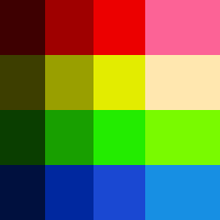
Before I dive into the creation of color palettes, I want to explain how to maximize each color, to get the most out of every color in your palette. Here’s an example color ramp:
Nothing about it seems particularly special. But notice that some of the colors are arranged in very thin bands while others are in larger blocks. I’ve arranged it this way to show how some colors are used as larger colors (“cluster” colors, to be used as a base shade for a surface), while others are in-betweens (“buffer” colors, to help blend the clusters together).
What happens if we change the ratios a little bit?
This ramp uses the same colors, but as a whole it looks lighter because of the way the colors are used—the relative amounts of each color are different, the clusters and buffers have been reversed. The result is a shift in the entire ramp’s saturation and brightness. The contrast, however, stays at at the same level of pleasant readability.
What’s the point of this example? To show that you can push your colors to work for you, rather than be confined by them. I’ve seen a lot of people trap themselves in with their palettes because they were too afraid to push their colors.
It leads to another point of contrast—one that you will constantly be using as a good pixel artist: a color looks different depending on the colors around it, and how much of those colors are used.
Why conserve colors? In the old days, hardware was a lot simpler and games had very specific limits about how many colors they could use. Getting the most out of each color was perhaps the most important aspect of pixel art back then, and the idea has carried over to today. Modern games don’t have those kinds of limits, but it’s still good practice to keep your palettes as small as possible. Not only is it much easier to manage your art’s colors with a tighter palette, but it will create visual consistency that will hold everything together.
So it’s time to make a palette. There are a lot of ways to go about choosing your colors. A lot of people will try to hammer out a “definitive” palette before they even start working—I’m guilty of that myself. It’s not the best approach, though. The best palettes are tweaked as they are being used. Don’t feel the need to trap yourself into something.
But where to start? Usually with some basic color ramps.
A color ramp is a grouping of colors that give you a range of shades to work with, usually arranged from darkest to brightest. This is a color ramp:
It’s not a particularly good one, though. It’s what we call a “straight ramp”—because it goes straight from dark to light. In other words, the only thing that changes is the brightness or luminosity, but not the hue or saturation. In a good ramp, the hue will change—because that’s how light works in real life.
In this example, the darkest shade hints towards a purple or red hue, while the lightest shade is green (on its way towards yellow). As long as the colors in the middle are recognizable, the overall huge of the ramp will be preserved. And don’t forget to always keep contrast in mind.
This is called hue-shifting.
Typically, darker shades will have less saturation and be skewed towards blue or purple, while lighter shades will be more saturated and skewed towards yellow. But while that’s a good starting point, don’t feel the need to confine yourself to those rules. Once you’re comfortable with making strong color ramps, be adventurous!
A color palette is a collection of your color ramps, and its what you would use to keep your colors organized. There are lots to talk about with palettes, so I’m going to start by showing you an example of what not to do.
I see this a lot. And when I say “a lot”, I mean I see this constantly. Everywhere. It seems to be the first thing a new pixel artist will make when trying to come up with their own colors.
So why is it bad? Aside from the immediate problem that the ramps are “straight ramps”.
The big problem is that this isn’t a unified palette, but a collection of individual ramps. It doesn’t appear to be created with the big picture in mind—each color was built individually, and as a result the palette has a disconnected feel. The reds were created darkest to lightest, and then the yellows, and then the greens, etc etc. There’s no overlap between the colors; they don’t mix together at all.
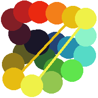
This is how I build a palette:
Sure looks different, doesn’t it? When I create a color palette, I’m not afraid to make a mess. I treat it like a real painter’s palette (remember that pixel art is much closer to painting than drawing).
The idea is in the unity of the colors. Each ramp branches away from the same darkest shade and eventually reach the same lightest shade (notice that the light yellows in the opposite corners are in fact the same color). As a result, the entire palette is cohesive. I suggest that you take a similar approach—don’t feel the need to arrange your ramps into neat little lines just because you’ve seen them organized that way before. The colors need to flow into each other, so keep it organic. You can always rearrange them afterwards.
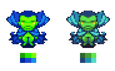
Before we move on to the next section, here’s a scary evil alien:
The sprite on the left is made with the first palette (the bad one with the straight ramps). The obvious problem is that the saturation is way too bright—it’s an eyesore. More relevant, the blue and the green don’t mesh together very well at all—the contrast is so high that the sprite doesn’t feel cohesive. At the same time, the contrast within the color ramps (particularly the green), is too low. The result is an awkward mess: the green areas look very flat, but the blue is so different that is stands out too much.
The guy on the right uses colors from my more organic palette, and it’s obvious that the colors blend together in a natural way—if you look at his legs, you can see that the darkest shade of blue works overtime as the darkest shade of green.
That should cover colors and palettes, at least the important stuff. In the next section we’ll start putting this into use and making some sprites from scratch.
Next: Form and Light


