It’s time to talk a little more in-depth about my buddy contrast.
Yup, we’re going to have a whole section on contrast. It might seem a little boring, but pay attention: everything else in this tutorial series is going to hinge off of the concept that I present to you here. I say that I want to get you to think in terms of color and contrast—what does that mean?
When you’re creating a sprite, you have a limited amount of colors to work with (these days, you might not have a limit on a technical level, but for the sake of consistency you want to conserve colors where you can. this is why people create palettes, which I’ll be covering soon). You also have limited space—extremely limited. The entire purpose of pixel art is to create small images (typically sprites and tiles for games with tiny resolutions). Small enough that each and every pixel—that means each and every color—will affect the look of the piece. The goal of a great pixel artist is to get the most out of each individual pixel. This is achieved by using the right color on the right pixel—that’s easy enough to grasp.
But more importantly, every pixel needs to work for the image as a whole. When you’re working on a sprite, you want to zoom out constantly (or, if your art program of choice allows, have a little preview window that shows what the sprite looks like at 100% or 200%). Keep the big picture in mind—and a great trick to making sure it all works together is to look at the invisible space between the pixels.
When two colors are directly next to each other, the human eye naturally builds a bridge between them: it creates an invisible color that isn’t seen or even processed consciously. That’s how contrast exists in the first place; in fact I would argue that contrast itself is an invisible color. And that’s the key to this section, and the big idea for you to take away from this section: contrast itself is an extra color.
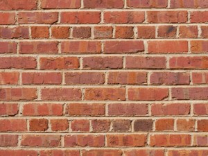
Here’s a visual: imagine that each pixel is a brick. The lines between them are visible, but are formed by the contrast between the pixels.
The idea of representing the colors between pixels—when applied to animation—is a pretty advanced technique known as subpixeling. But for the time being put that our of your mind: this is about getting the most out of your colors by using contrast.
The yellow on the end has two functions: it’s the brightest red as well as the brightest green. The only reason that this works is because of the contrast with the color that it’s next to. The contrast between the yellow and the mid-red is very close to the contrast between the yellow and the mid-green.
When the yellow is placed next to the green, the eye creates a bridge between the two colors that allows the yellow to function as a green itself (in other words, the yellow takes on an invisible green hue). Likewise, it becomes red when next to the other reds.
Let’s take a look at how this works in practice. Here are a couple of sprites.


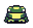
Aren’t they adorable? The same yellow is used on both of them, but on the boy it functions as the brightest color in the skin tone. On the frog, it completes the green as a highlight and also works as a light color for the belly.
Now to drive the point home, we need to take it further. Look what happens when we put that same yellow right up against the red or green without the middle tone as a buffer.
The contrast between the yellow and the other colors is much greater than it was when the yellow brushed up against the middle color. The eyes don’t have an easy time making a natural bridge between the colors, and as a result the colors stand on their own.

The contrast between Link’s hair and his hat is much sharper without the lighter green color as a buffer—notice that the green is still used as a highlight on the top of his head but isn’t touching the yellow.
So what’s the lesson of this section? I’ve got to repeat it again: the contrast between colors becomes a color itself. I know that I haven’t gotten much into implementing the idea yet: like I said before, the purpose of this was to get you thinking and seeing your pixels as more than the bricks, but the stuff between them too.
While we’re at it, notice that the skin of his face is the same color as the middle tome that we used above between blend the red and yellow. But because it’s used in a big flat area, the contrast between it and the yellow is sharper than it was before—an idea that leads very nicely into the next section.


