If you’ve been following from the beginning, now you understand the importance of colors, and just how crucial contrast is. You’ve even developed a color palette of your own. It’s finally time to put that knowledge to use.
We’re going to start off by covering the basics (more basics?): form and light. In my introduction, I stated that my goal with this series isn’t to create a “how-to” guide, but to help educate and train your mind so that you have the knowledge and skills to become a good pixel artist. The most aspect of that method of teaching is that it’s important to get you thinking about your pixels in the right way. So here’s something that’s important to remember: When you create something with pixel art, you want to think three-dimensionally. This is true of any kind of art, not just pixel art.
The trick to thinking three-dimensionally is in the approach. I’ve seen hundreds of pixel art tutorials and so many of them teach you a simple step-by-step process: make an outline, fill it in, then shade. In my opinion, that approach is absolutely incorrect. Sure—there are a lot of tremendous pixel artists (certainly some are better than me) who take the outline-first approach. But the important thing to take from this is the mindset—the way to think about your pixels and your art.
So let’s dive right into it.
Light Creates Form
The key to thinking three-dimensionally is about thinking in terms of form rather than shapes. The world that we live in isn’t made up of shapes, it’s made up of forms. The difficulty in creating pixel art comes from rendering those three-dimensional forms on a two-dimensional plane (the computer monitor). Fortunately, the human eye naturally looks for things in three-dimensional space, so it isn’t too difficult to create the illusion of depth.
And this is a form:
Simple, right? A shape is two-dimensional: it’s a line drawing on paper. A form is three-dimensional and has depth. The difference between a square and a cube is that one is a shape and one is a form.
That’s not a particularly hard concept to grasp. The next idea is important to keep in mind when representing forms: light. A form is only as good as the light source (or sources) that defines it.
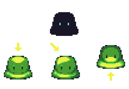
Lets look at some slimes:
Aren’t they adorable? :)
Each slime has the same form—if you take away the lighting, all three of them use the exact same silhouette. I started these by creating the silhouette and let the light tell me how to color them and fill them out.
You can clearly see the forms because of the light—the light creates depth, and depth is required for three-dimensional readability.
Your light source is more than just direction—it affects your colors, too. When you spend more time working with colored light sources, you’ll be able to take advantage of colored highlights and shadows for a really cool effect. But for the time being, your palette should already be taking light into account— that’s why we talked about hue-shifting in the previous section when we chose our colors.
When you’re just starting out, I suggest that you use an arrow to indicate light source like in my example above. After you make a few sprites, keeping light source in mind should become second nature. That’s the purpose of this section of the tutorial: constantly thinking about every sprite you create in terms of its forms and light source will help you create sprites with more depth.
Sculpting with Form
What’s important to think about is how it will affect your art. Let’s look at it in a more practical example. I managed to dig up an old sprite that I made (around 2007).

I’m almost embarrassed putting this on the internet today. Why? It’s really flat—when I made this I paid little to no attention to thinking about the character in terms of three-dimensional forms (and because the colors have pretty poor contrast and no hue-shifting, among other problems). When I made this sprite, I started with an outline of what I thought was a standard RPG character, and then filled it in. The problem was that I wasn’t thinking about how an actual human would be rendered in three dimensions: instead of thinking about the individual forms that make up a human, I was thinking about coloring in my outline.
The next sprite is more recent—I made it in early 2011.

Huge difference, right? Ignoring the colors and the hair, the biggest fundamental difference in these sprites is the attention to form. What changed between 2007 and 2011? I realized the importance of spriting forms-first.
When I created the newer sprite, I didn’t start with an outline: I started with a silhouette and some highlights, and worked at sculpting and refining. On top of that, I thought more about the human body and modeled the sprite on an actual person’s anatomy, rather than basing it on a general idea of “RPG sprite”.
What is the big idea of this tutorial? Unlike most other pixel tutorials out there, I urge you: Do not start with an outline but start with a silhouette.
Starting with an outline will change the way you think about your sprite: it will naturally put you in a “coloring book” mentality, which will inevitably make the entire sprite look flat. If you think about the multiple forms in three-dimensional space—and how they would be rendered when they are lit up by your light source—everything will come together in a natural way that conveys depth.
A lot of great pixel artists start with the outline first—I’m not saying that it’s the wrong way to make a sprite. There is no wrong way. But the great artists who take that route have experience thinking in terms of forms and light to begin with—the process that I’m teaching you will help you visualize those forms as you create them. Once you get the hang of doing things this way, you should feel free to experiment with other methods.
This is why pixel art is more like painting or sculpting: you’re working with a MATERIAL—pixels. Pixel art isn’t about your strokes: it’s about building.
Sculpting with Form
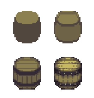
So let’s put it together and make something new. Open up your art program of choice and follow along—you don’t have to create the exact same object, but I’d like for you to take a stab at making something similar. Make an object with a relatively simple form, choose a light source and go to town bringing it to life.
In my example I made a barrel object for an RPG. In most RPGs, the light source will be pretty easy: a straight top-down that allows for easy mirroring. Start with your basic silhouette and sculpt your form until you have something that looks like the object, and then add the details to give it some personality.
Leave a comment and show me what you’ve got so far.
In the next section we’ll use what we’ve learned to start putting together an RPG character.
Next: Creating an RPG Base


