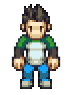
Okay! It’s time to dive into creating a character sprite. Like my previous tutorials, this is going to be focusing on a sprite for an RPG style, but the same ideas apply for any kind of style or perspective. It’s not about following the steps that I lay out here, it’s about seeing the process and understanding the thought that goes into it.
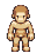
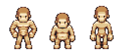
We’re going to start by picking up where we left off. You remember this guy, right?
I feel like making a heroic character for a modern-set RPG, and this base is going to be the starting point for the sprite.
It’s not always the right idea to start from a base—in fact I would actually suggest that it’s not a good habit to get into. Confining yourself to the limits of a premade template can stifle creativity and prevent your sprites from having individual personalities. It is typically most helpful in an RPG where you need to mass-produce NPCs in a consistent style.
If you’re working on a different genre, like a platformer, then I would suggest not working from a base at all and creating each character individually.
Don’t think that you have to stay perfectly to the form of the base. It’s not a statue, treat it like clay: you can stretch it and move it as you need—do what is best for the character you have in mind. If all your characters have the exact same body shape, they will become dull pretty quickly. I would suggest that the more willing you are to exaggerate your base for each character, the more personality your sprites will have. It only takes a few minutes to come up with variations and the results are worth it.
But for the purposes of the character that I want to make today, we’re going to stick with the regular proportions.
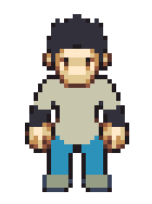
The first step is easy, especially if you have your character’s design in mind (or are working with a reference or concept art). Like we did when we first made the base, we want to block out chunks of silhouette to create a base for the forms:
He’s got a shirt, jeans and shoes, and he’s going to have some slick spiked hair. See how the bottom of the shirt curves—that’s because of the RPG perspective, and it’s something you’ll want to keep in mind.
Note that I blocked in right over the details on the base. When a lot of people start to create a character on top of a sprite base, they’ll simply recolor the skin. I strongly suggest that you don’t do that—the result is that clothing is awkwardly skintight and it doesn’t cling to the body in a natural way. As always, you want to work with the three-dimensional form in mind, and the best way to do that is to approach your pixels as if they were a sculpture or painting. Remember that you are not simply editing the base, you are using it as a guide to creating a character.
As you can imagine, the next thing we do is start with our preliminary shading. Define those forms!
Starting to look pretty classy. I gave him a splash of green on his shoulders so his shirt has some more personality, and the hair has some clearer definition to the spikes. So far, so good. Let’s keep at it and do some more refining:
Pretty solid, he’s nearly finished. But there’s a huge problem: I said that I wanted to make a hero. This guy doesn’t look anything like a hero, but more like a nobody NPC.
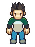
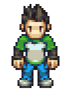
While the sprite is passable right now, it doesn’t have the extra oomph to give it character. To really take him to the next level, we need to add some more touches and details that will make him stand out. It doesn’t really take much:
I’ve added an extra color and changed the shading on his shoulders to have a more vivid pop, and his shirt has a green trim at the bottom. And his jeans have more detail now, among other smaller changes. Now he’s looking a lot better—he feels more like a recognizable character. It’s possible to take it even further—depending on your plans for the character and the setting of your game, you could go any direction when it comes to accessories and outfits. Personally, I like to keep things simple and bright for readability purposes (and because it makes animation a hell of a lot faster).
Speaking of animation—next time we’ll cover the basics. Look forward to it.
Next: Working Fast


